case study
Rebranding the product post-acquisition with variables

Intro
After InvestorFlow acquired Coyote Software, there was a short window to introduce the InvestorFlow brand to clients and within the product. The initial brief was to update the product logo, URL, and section names, but I pushed for a full re-brand as this would have looked very half-hearted.
Task
I updated the rest of the UI, including icons and illustrations. Using the semantic variables I had introduced to the design system the year prior, I built a new variable mode to show the InvestorFlow branding.
Results
Once mockups were signed off, the UI team successfully implemented the semantics and switched themes within two, updating colours and illustrations with zero downtime, in coordination with the marketing team's acquisition announcement.
Role
Project lead, collaborating with product management, UI engineers, marketing and C-suite stakeholders.
01
Mocking up navigation options
I focused on updating icon colours, buttons, and navigation. I began by referencing the InvestorFlow brand guidelines and mocked up several side nav variations, where the logo and prominent icons live.
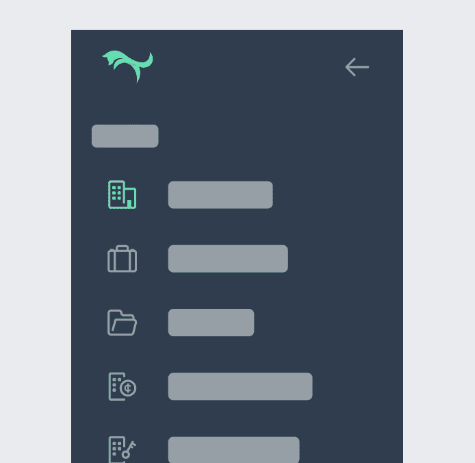


It was clear that just changing the logo would have minimal impact, and would ruin any brand recognition for InvestorFlow, who used a very different colour palette to Coyote Software.
Once a direction was chosen, I mocked up full screens to demonstrate the changes and toggled between old (Coyote) and new (InvestorFlow) branding. These helped preempt questions from stakeholders and allowed a quick sign-off.
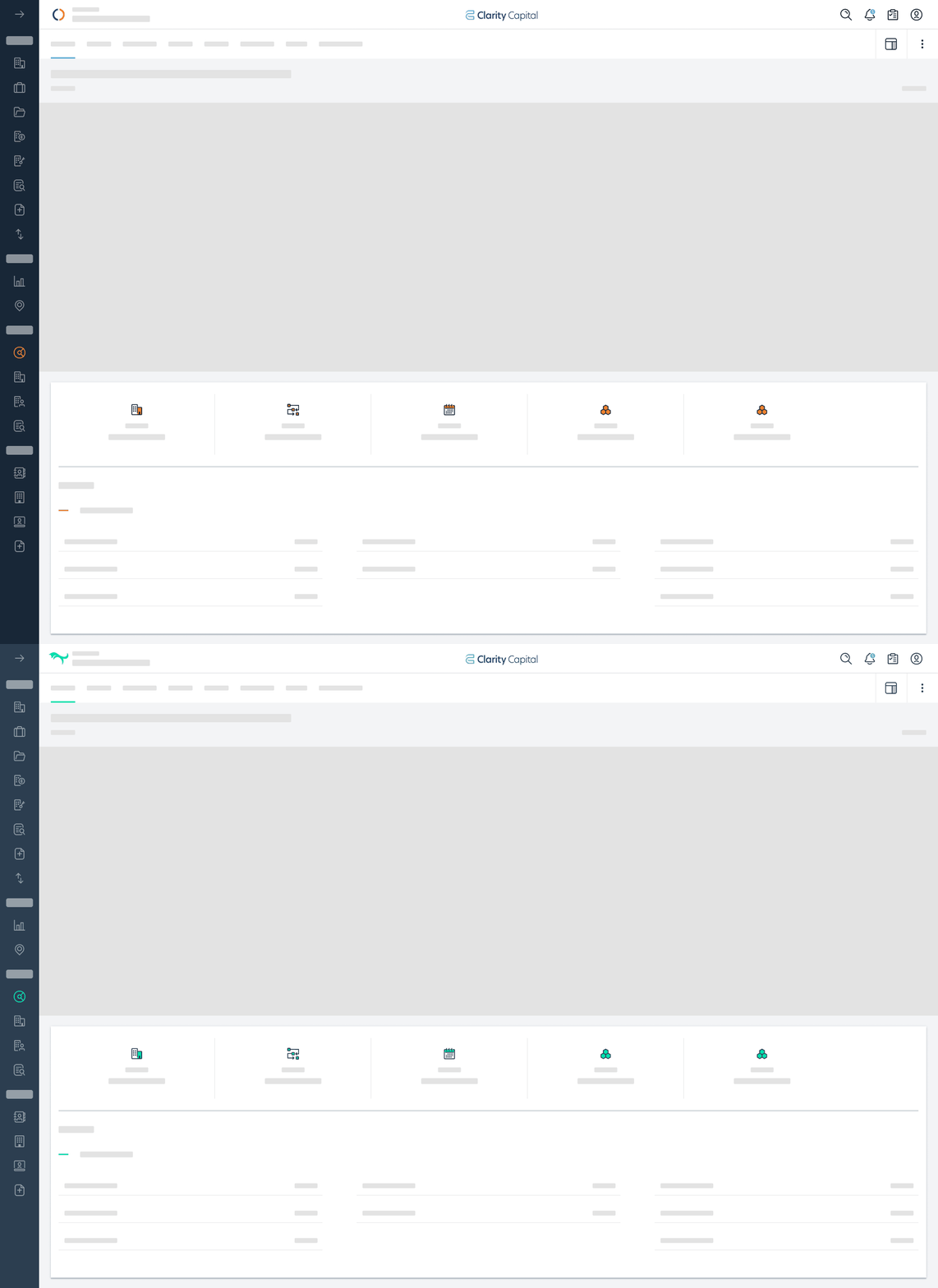
Mockup of branding changes to navigation and icons
02
Setting up new primitive and semantic variables
With the concept approved, I built new variables based on the brand guidelines. I adjusted primitives to meet accessibility standards and added a few more to allow flexibility in UI elements and illustrations.

New (InvestorFlow) / old (Coyote) primitives

New (InvestorFlow) / old (Coyote) semantics
03
Updating product illustrations
Previously, we used custom 'happy' and 'sad' Coyote mascots throughout the product. These were less fitting for the more mature feel of the InvestorFlow brand.
Due to the short timeline, I used an Envato illustration library and customised it to fit our style, adjusting colours and stroke weights. This allowed us to quickly produce a larger, more task-specific set of illustrations with a more mature tone, while keeping some personality.

Coyote illustrations

InvestorFlow illustrations
03
Handoff to UI
As the team had already implemented the Coyote theme to the front end the month prior in preparation, this was an easy case of handing over the new primitives and checking that they swapped the semantics for the correct primitives!
Illustrations changes also relatively quick, but required some more mapping of use-cases to ensure we tailored the illustrations shown for each message.