case study
Designing customisable checklist templates

Intro
Asset Managers lacked a reliable way to manage ESG-related tasks across their portfolios. Work was often tracked in outdated spreadsheets, and rarely consistent across teams. Progress was hard to measure and even harder to compare across a portfolio.
Tasks
Design a reusable, customisable checklist template for ESG tasks
Create a usable checklist interface that could be attached to assets or units (not covered in this case study)
Explore aggregation and completeness tracking over time (not covered in this case study)
Results
Although the feature was deprioritised before development, internal feedback was highly positive. Post-feedback designs improved usability significantly, and it's clear this work would have enabled teams to standardise ESG processes across portfolios more efficiently.
Role
Design and research lead, and collaborating with product management.
01
What was the industry standard for EPC checklists?
Before designing anything, I needed to understand how teams currently managed ESG checklists. I found that:
Checklists varied greatly between clients
ESG requirements differed by country, with many teams working across regions
Progress was measured with a variety of metrics
Visual cues like colour and status were common, but inconsistent
Files were often overly complex and stored in multiple locations
These insights confirmed the need for a flexible, standardised solution.

Example checklists
02
What makes a good checklist?
While the platform already included 'tasks', these were ad hoc and not repeatable. I researched existing task management and document tools, evaluating usability against key needs like:
Template creation and reuse
Custom metrics and visual indicators
Assignment and ownership
Notification support

Product research
03
Early ideation and MVP scope
While the Product team drafted a sample checklist as a potential template, I explored user pain points and early concepts.
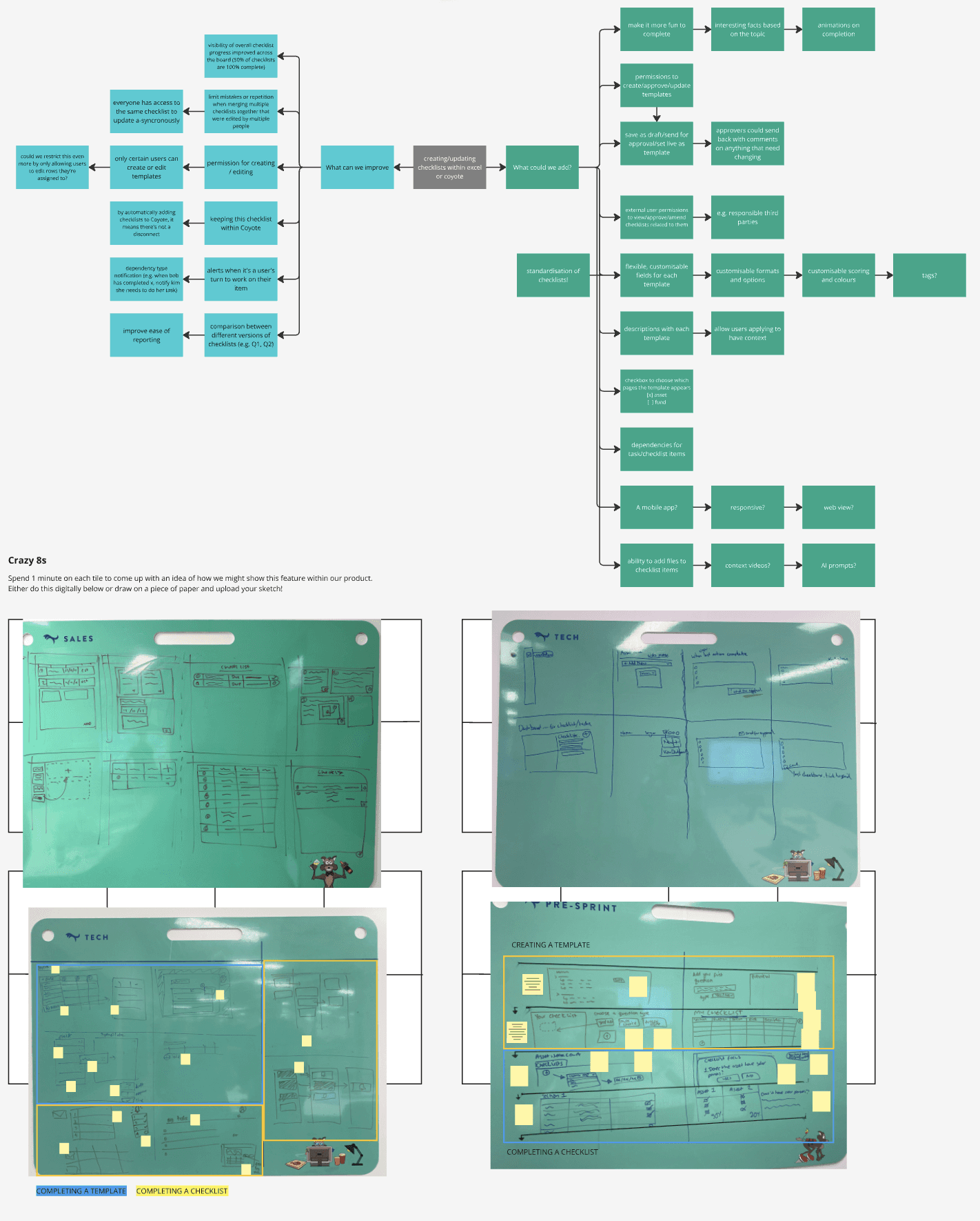
Mind mapping and crazy 8s examples

Early wireframes
I broke delivery into three phases:
Template creation (MVP)
Checklist application to assets or units
Progress aggregation across time and portfolios
04
Starting from a blank canvas
Initially, I considered providing a 'starter' template, but with no common standard across clients, we instead launched with a fully customisable 'blank' template.
Users could define column types, checklist items, and metric types. Based on user examples, the available column types was reduced from 14 to 5 for the MVP, simplifying complexity while still offering flexibility.

Checklist template layout
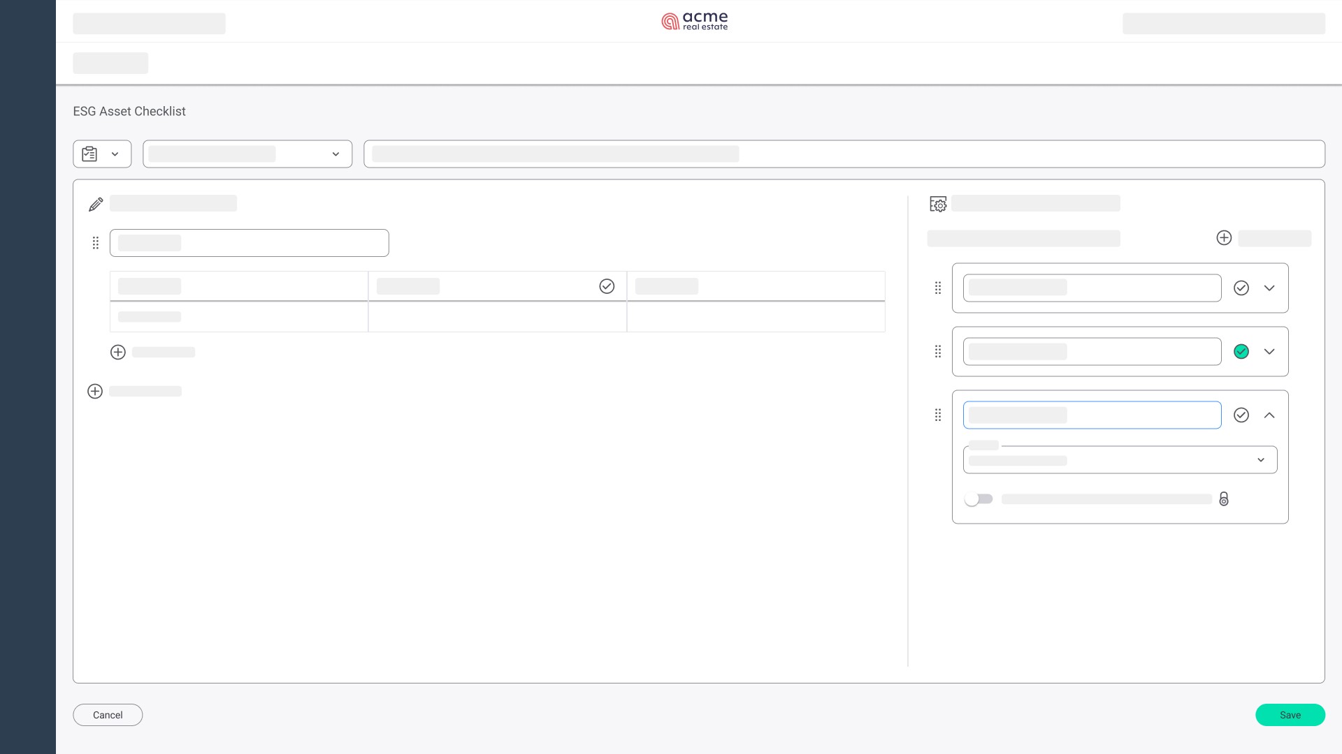
Checklist template design
05
Early feedback and usability challenges
I led user testing sessions using Maze to gather both qualitative and quantitative insights.

Maze score review
While most users described the process as “easy”, interaction data told a different story:
Users found the blank template intimidating
High misclick rates (53%) in the column section
Some comments noted the interface felt "overwhelming" with too many decisions upfront

Misclick rates
06
Improved designs
To address these problems, I redesigned the experience around a wizard-style flow, introducing clear instructions and visual context to guide users through, instead of dropping them in the deep end:
Naming and describing a template
Selecting column types step-by-step
Previewing the structure before finalising
This approach reduced cognitive load and made the experience feel more approachable.

Step one - template details

Step two - add section(s)

Step three - customise column(s)
07
Key takeaways
Although these designs weren’t implemented, leading the research and gathering both qualitative and quantitative data to guide the design direction was a valuable process.
The improved designs gained strong support from internal stakeholders who said it was "much simpler to understand fro the start". I hope that this project will be re-prioritised again in the future.